Friday, 9 November 2012

Ideation process : Inklink Whiteboard


At InkLink, I started this unschool whiteboard sessions to demystify and discuss various issues regarding design, art and creative thinking. I strongly believe, creativity should not be institutionalized and must reach all across globe. this very ideology instigated me to found InkLink. The unschool whiteboard sessions will be 'real life' sessions beyond class room. In next few slides, I will try to explain on how to ideate (a product / concept) from a tangible inspiration.(Kaustav Sengupta)


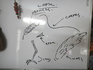
for example... lets take 'bird' as an inspiration... the three key elements that can be segregated and derived are : the 'look' of a bird, the 'function' of a bird and the other intangible elements such as 'social semiotics of a bird', the relationship patters, the concept of 'femininity' etc.


the 'look' can again be clustered into all these (and much more) elements... the beauty of curves, the colorful feathers, the bend of beacks etc.


the functions can be the 'flying' ability of a bird... the 'lightness' of a feather etc.


the social semiotics can be the way bird communicates with each other 'tweet' 'tweet' (yah... the twitter and its 140 characters...) the feminine curves of a swan etc.


or, even the key concepts can be converted into mythical characters...


the key elements can be interpreted and derived into product concepts... as shown here

Sunday, 4 November 2012

Inklink session : understanding inspiration and its application

lets learn a bit on how the basic inspirations can be implemented aesthetically. the example can be the flower blossom and its detailed representation (as referred below)

Flower Blossom: the inspiration

The applications:-


the concept of 'blossom' can be reflected in a product like this pouch or a bigger bag or some interesting bags.


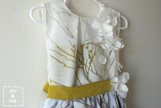
it can be realistically explored into a dress


or in detailed dress...


Lady Gaga dress


in graffiti art


in Jewellery be it on ring or pendant...


in product display / VM (blossom arrangement of perfume bottles)


window display / VM

in accessories, shoes...


in greetings card..


in fashion head-gear..


in Architecture,interiors....(blossom house interiors)


in cushion cover print


in lampshade/ lights..direct silhouette implication


in furniture/ table..abstract blossom structure..

In short inspiration can be implemented through visual patterns,silhouettes,surfacing, prints ,abstractness or direct .

Thursday, 16 August 2012

Session: How to make a DIY "Goth Hoot" tee


1st step : preparing the stencil design:


draw the artwork on a paper / plastic sheet (you can also trace it.. let me know if u want a template). ensure that the artwork is not very intricate / detailed


cut the spaces like a stencil... remember the knife can cut fingers too ;) oh yes, please use a newspaper underneath while u cut or else there can be scratch marks at the floor... You can also use cutting board


hold it opposite to light to see if the cutting edge looks fine. Now the stencil is ready.

2nd Step : preparing to stencil design on tee


lay the tee, insert a plastic sheet inside (or else the other side of tee will be effected too)


place the stencil in right location


keep books at both the sides to ensure zero movement of stencil

3rd step: doing design effect on tee


use the fabric stain remover (I used "RIN ALA")... pour it in a sprayer.. ensure that all ur metal rings & bangles are removed from the hand (or, u can wear a glove too)


spray the stain remover on the tee via stencil....see how the colors change... spray more if you need different lightness at spaces


the 'dripping effect' makes the hoot really gothic


after the required effect, remove the stencil and gently wash the tee with fabric softener (as shown above)


do the detailing with permanent marker and hang the tee for drying....


draw more details once the tee is dry...


your tee gets ready, wear it and awe others ;)

DIY "Goth Hoot" upcycled Tee :)


it's fun and really easy to make a 'goth hoot' upcycled tee :) a good way to reuse the 'boring' monotone tees that you have already dumped. What you need is thick paper / plastic sheets, a tee, a stain remover (stronger the better), a fabric softener, paper cutter knife, pencil and patience —

Thursday, 9 August 2012

Cross domain creative workshop, a knowledge barterning initiative from Inklink Collective Unschool founder Kaustav Sengupta


Young creative minds from diverse design backgrounds have come together to form DAClan – the Design and Arts clan. In a nutshell it is a Not-for-profit platform providing an opportunity to interact, be mentored, and learn/unlearn stereotypes. Design domains such as Fashion, Architecture and interiors, Graphic, Photography and Art are well represented within the modest group of 8 core clan members. we aim to create a network of creative individuals, to nourish their skills and share our collective knowledge among other aspiring creatives. Our main objective is to create awareness about the design practices and explore opportunities of designing in the ‘unschooling way’. We aim to achieve the above by conducting creative edu-fun workshops on a variety of topics such as inspiration, recycle, logo designing, DIY (do it yourself),etc. Incidentally, the first workshop is christened “Whimz n Sparkz” the course behind the concepts. Wherein, speakers from different design backgrounds are invited to narrate on how they derive inspiration for their work and what it means to them. A ‘hands on’ workshop format is planned to guide the youngsters towards the unschooling mode and encourage them to use their right brain more. Participants also get an opportunity to present their work in the 3*3 twitter mode, further boosting their confidence. So, this is what the DAClan strives to achieve.

write up - Kirthu Bala, (DAclan core member)

First ever edu-fun creative workshop in Chennai. The Journey continues…


Scraps of paper, color and amicable clatter were the epitome of DAClan meets over the last few days. What with the preceding gatherings being hectic with registration processes, logo designing, finalizing workshop format AND making the poster collage. The logo deciding process was a heady mix of creativity and simplicity, wherein over 12 options were created by clan members and posted on the DAClan page. The viewers “liked” and commented on their choices over a period of 5 days. The comments were genuinely informative and amended us to arrive at a mutual conclusion with trial and error technique. Our special thanks to Zil Zie, Nirmal Texinger and Vinati Bhatt for, their keen interest in the logo process and development and we are grateful to each and everyone who shared their valuable thoughts and took part in voting process. Logo options from the respective Clan members:-


Finalized logo option:- (Jay’s option)


Our collective Twist:-


The final logo atlast!

The logo defines DAClan in its true form, a single stroke to form “D”, “A” and “C” in various tints and shades of blue and yellow to symbolize youthfulness, creativity and enthusiasm to share knowledge and experiences.


Members deep in work

The poster making was altogether another story. Torn magazine sheets, the smell of fevicol and striking colors- what more can a creative mind ask for! They often say the “Journey is more important than the destination”. Of course our journey to the first workshop has been nothing but memorable, getting to know each other, truly relishing one another’s company and cracking irrelevant jokes. With just 2 days to go for the first workshop at “Elliots beach” on Sunday the 12th August at 3:00 pm , pressure to deliver beyond expectations is mounting. Our first creative exploit, hoping everything would go well! Cheers!

Kirthu

Aka Kirthana.B

Core Clan member (daclan)